


"I had no idea what I wanted to do with my life and no idea how college was going to help me figure it out."
The illustration depicts clouds with varies opacities which creates the appear that the clouds are clearing up. The clouds act as a representation of the unclear future at university. Some of the clouds opacity is weaker than others, to give a more transparent appearance. I created this effect to make the future seem positive and that the positive future is not too far away. Plus, by having some of the clouds overlay each other the clouds seemed akin and reduce the image from looking heavy static image a light impression like a cloud.
Grey is a combination of black and white good and bad, grey is neutral. I chose a selection of greys because behind the clouds there is the unknown, you don’t know if it’s good or bad. The light tones of grey represent the potential positive opportunity, whilst the darker grey clouds symbolize the potential negative opportunity behind the clouds.

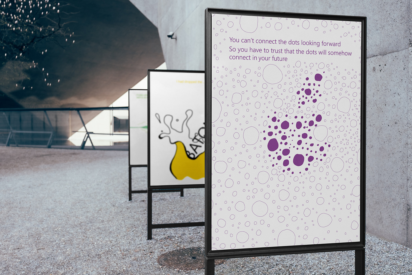
"You can’t connect the dots looking forward. So you have to trust that the dots will somehow connect in your future."
This illustration was inspired by the word ‘dots’. The illustration is meant to depict an unclear image of an apple, to visual represent how the dots don’t connect without knowing the past. The image is meant to depict how we can see the past from the present, rather than looking into the future.
The dots create a rough outline of Apple’s logo. The Apple logo is created with similar dots in the background the only different between the background and the Apple, is that the Apple has solid purple dots whilst the background dots are purple outlines.
I created this contrast between solid and outlines, because the solid dots are highlighting the clear future we can see now. The Apple’s and background’s dots technically are the same, because I wanted to depict the concept that you can’t connect the dots looking forward, so the familiarities of the background and apple represent the unclearness of not knowing how the future is going to plan out.
I chose purple, because it represents wisdom. I wanted to reflect wisdom, because I thought that these were wise words that would be encouraging for students who feel like they can’t see how their dots lining up.

"I had dropped the baton."
This illustration is a combination of text and image interacting with each other. The text ‘baton’ literally stating and symbolically representing a baton falling into liquid. The liquid is there to visually demonstrate how someone may feel when they drop the symbolic ‘baton’ or either it can be seen as the heavy baton weight being lifted off their shoulders, with a dramatic and exciting energetic splash, it depends on the audience’s frame of mind.
The yellow color, hopefully balances out the negativity impulsive thoughts of failure. Yellow is seen as a positive and joyful color, which I hope sheds some light and changes the situation into a positive experience, for instance you are taking matters in your own hands and taking charge, instead of being dogmatic.

"If today were the last day of my life, would I want to do what I am about to do today…"
This illustration is depicting the theoretical tight wire of life we walk. It shakes, because we are questions our current situation. This poster is meant to encourage positive change and encourage healthy inquiry, because at the end of the day that is what I believe you go to university for, to learn and question your theories.
The wire goes across the page and gives the impression it carries on off the page, this is to give the impression that the wire is strong, even though it seems unstable. The green color emulates a safe quality that counter acts the uneasy wobbliness of the wire. Other than creating a safe atmosphere within the illustration I chose green because it also represents growth and nature. Growth translates to change, and this image is about questioning the constant and thinking about taking part in change.

"Don’t be trapped by dogma"
This illustration is meant to give its audience encouragement to not follow others and do what they say, but do what they want to do and live for themselves and not for others. This illustration I struggled with the most to translate the text into an illustration. Each box represents a controlling person trying to force someone, the black circle, to believe in what they want, hence why the circle is split within five boxes that represent controlling people. Other than the circle connecting the boxes together and appear like one full image, the text with in the four larger outer boxes have text within them I believe aids the viewer’s understanding that the boxes are all connected to each other and create a complete picture. I also did this, because I thought that the sentence – ‘Don’t be trapped by dogma’ was stronger by itself rather than being connected with the second sentence – ‘which is living with the result of other people’s thinking’.
I chose to light blue because, blue is used to represent freedom. The brightness of the blue was to add encouragement and positivity, whilst at the same time I personally feel that the light blue creates exciting energy through its brightness, I hope that others experience this same energy so that it empowers them to not be trapped by dogma. I originally had the box in blue, but decided that change the boxes to black and the circle to be blue, because it is the circle that wants to be set free and not the boxes. Now through color the text outside the boxes and the circle seem to complement and have a stronger affiliation with one another, this alignment also applies now with the black text and the black boxes.


